5 Tips for Creating White Paper Landing Pages that Convert

How to Write a Great White Paper that Generates Quality Leads
April 27, 2019The No. 1 Benefit to Creating White Papers
June 16, 2018
White paper landing pages don’t have to be fancy. But they do have to follow some guidelines to improve conversions.
Landing pages are often the entry point to gated content like white papers. Yet so much can go wrong on that white paper landing page that you may never collect a potential client’s email address. And they’ll never read your amazing content.
Fortunately, you can do simple things to improve your conversion rate, as I recently learned from a webinar presented by Campaign Creators, a San Diego-based marketing agency.
In their webinar, Campaign Creators reviewed actual landing pages that attendees had submitted and pointed out where these pages fared well, and what mistakes they made. While the landing pages they reviewed focused on all sorts of offers, not just white papers, the tips Campaign Creators provided easily apply.
A landing page, by the way, is not your home page. It’s a page focused on a specific offer. And the design of that page is as important as the text.
Here’s what I learned:
1. Put your unique value proposition (UVP), your form, and your call to action (CTA) above the fold
Whether your landing page is displayed on a desktop or mobile, that trifecta must be visible at the top. Here’s an example of a white paper landing page from Healthcare IT News. Notice how the three elements are at the top?

2. State your UVP and put it in your headline
Seems obvious, right? But the webinar showed some real landing pages that had vague headlines and fuzzy UVPs. As a model to follow, Campaign Creators shared this headline from their own landing page: 20-Point Landing Page Audit (that’s your offer) to Improve Your Conversion Rates (that’s how it helps your customer).
3. Give an actionable, descriptive CTA
This appears in the clickable button, and that button shouldn’t say “Submit.” Instead, it should be something like, “Download the White Paper” or “Get It Now!” from the example above. Yes, make it obvious.
4. Ask only for information in the form that’s necessary for the offer
Some forms ask for phone numbers, addresses, even your firstborn child. The example above asks for quite a bit of information. Is that bad? Not necessarily. We all know that we have to give up some of our data to get something for free.
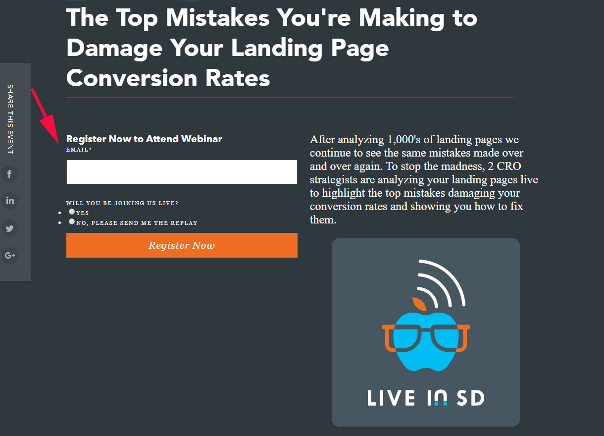
It also depends on where your potential client is in the sales funnel. Just know that asking for too much info, especially a phone number, may be off-putting and can affect conversions. If it’s a quick-and easy guide you’re giving out, just ask for a first name and an email address, or even less, like in the example below.
5. Remove opportunities for the user to leave the landing page
This concerns building a landing page on a regular web page. If you do that, the user sees all those other distracting, clickable links, such as website navigation at the top or in the footer. There should be only one action for the user, and that is to click on the CTA.
Need help with a white paper? Let’s talk about your project!
